EBENEDEN
LOGO DESIGN BOOK COVER DESIGN COMMISSION WORK
Overview
The first visual mark and book cover for EbenEden, a new company with a bold and contemporary vision. EbenEden Publishing was created as a storytelling device to communicate the owner’s personal journey of faith and serve as a guidance resource for all.
The brand’s logo—a simplified, three-part stone— symbolizes the Trinity and reflects themes of strength, unity, and spiritual renewal. The Crossroads book cover, featuring a large hand with its lines as literal paths, visually represents the idea that even when faced with choices, one remains on the path they were meant to follow.
Services
Logo Design
Book Cover Design
Personality
Gracious
Resilient
Hopeful
Typefaces
Muli Extra Bold
Muli SemiBold
Avory I PE Variable Bold
Software
Adobe Illustrator
Procreate
Trello
Developing a visual mark
The EbenEden logo draws its inspiration from the brand’s meaningful name, which combines two powerful biblical symbols: the Ebenezer Stone and the Garden of Eden. The Ebenezer Stone, a memorial of divine help, represents strength and remembrance, while the Garden of Eden evokes purity, life, and the promise of renewal.
In the early stages of logo development, the design closely resembled the original Ebenezer stone, containing twelve separate stones. However, the complexity of the original concept felt visually heavy and lacked the refined elegance needed to reflect the brand’s message.
Through iteration, the logo evolved into a simplified, three-part stone, symbolizing the Trinity. This minimalist approach not only made the logo more visually striking but also gave it deeper symbolic resonance, blending the foundational strength of the Ebenezer Stone with the promise of Eden’s grace. The three segments serve as a visual metaphor for faith, hope, and renewal, capturing EbenEden’s brand personality and purpose.


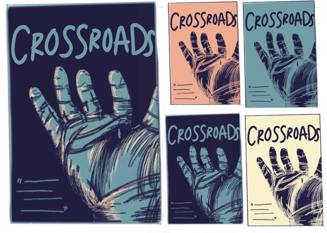

A cover with a deeper meaning
The Crossroads book cover was designed to reflect the journey of self-discovery and decision-making central to the story. The focal point—a large hand with its lines as literal crossroads—symbolizes both guidance and fate. The small figure walking along the lines conveys that even when facing choices, one is still on the path they were meant to follow, held within something greater.
To tie in with the author’s brand, we used their signature color palette, blending earthy warmth with gentle highlights to evoke introspection and light. As per request, the author’s initials are subtly hidden in the drawing of the fingers, creating a small discovery for readers to find over time.
