MOCHINUT
REBRANDING MENU DESIGN
Overview
Mochinut has gained popularity for its fusion of Japanese mochi and American-style donuts, offering a playful, chewy treat that stands out in the dessert market. However, the current branding and menu design don’t fully capture the excitement and creativity of the product itself. The visual identity lacks cohesion across different locations, making the customer experience feel inconsistent. The menu, while functional, can be overwhelming with its variety of offerings, making it difficult for new customers to navigate and understand the brand’s bestsellers.
This redesign aims to refine the brand’s identity, clarify the menu for a better user experience, and create a more visually dynamic and cohesive presence.
Services
Rebranding
Menu Design
Personality
Fun
Fresh
Typefaces
Unbounded Medium
Avenir Black
Avenir Medium
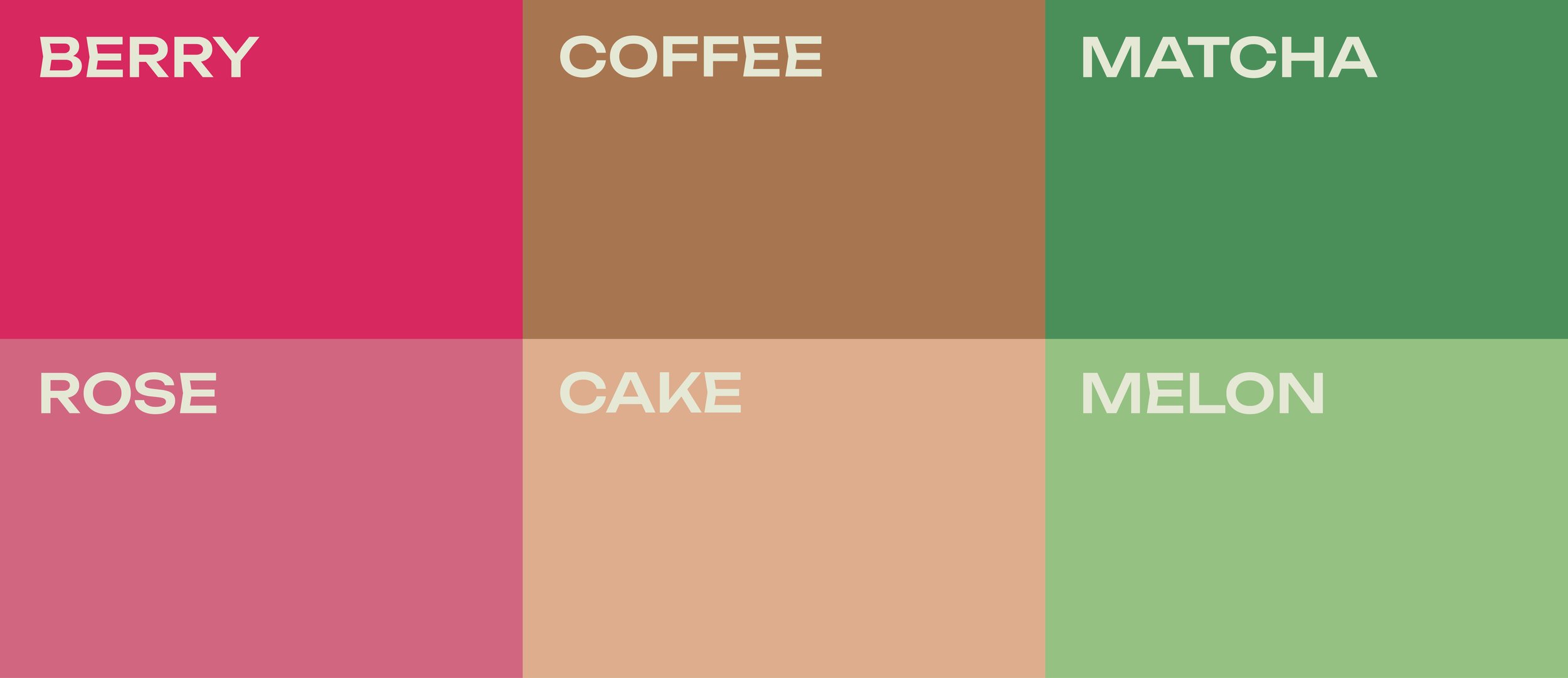
Mochinut’s redesigned color palette draws directly from the ingredients that define its unique fusion of flavors. The selection includes: Berry, Coffee, Matcha, Rose, Cake, and Melon. This spectrum of neutrals and vibrants captures the playful, fresh nature of the brand. This range of colors celebrates a modern, flavor-first aesthetic.

More than just a donut.
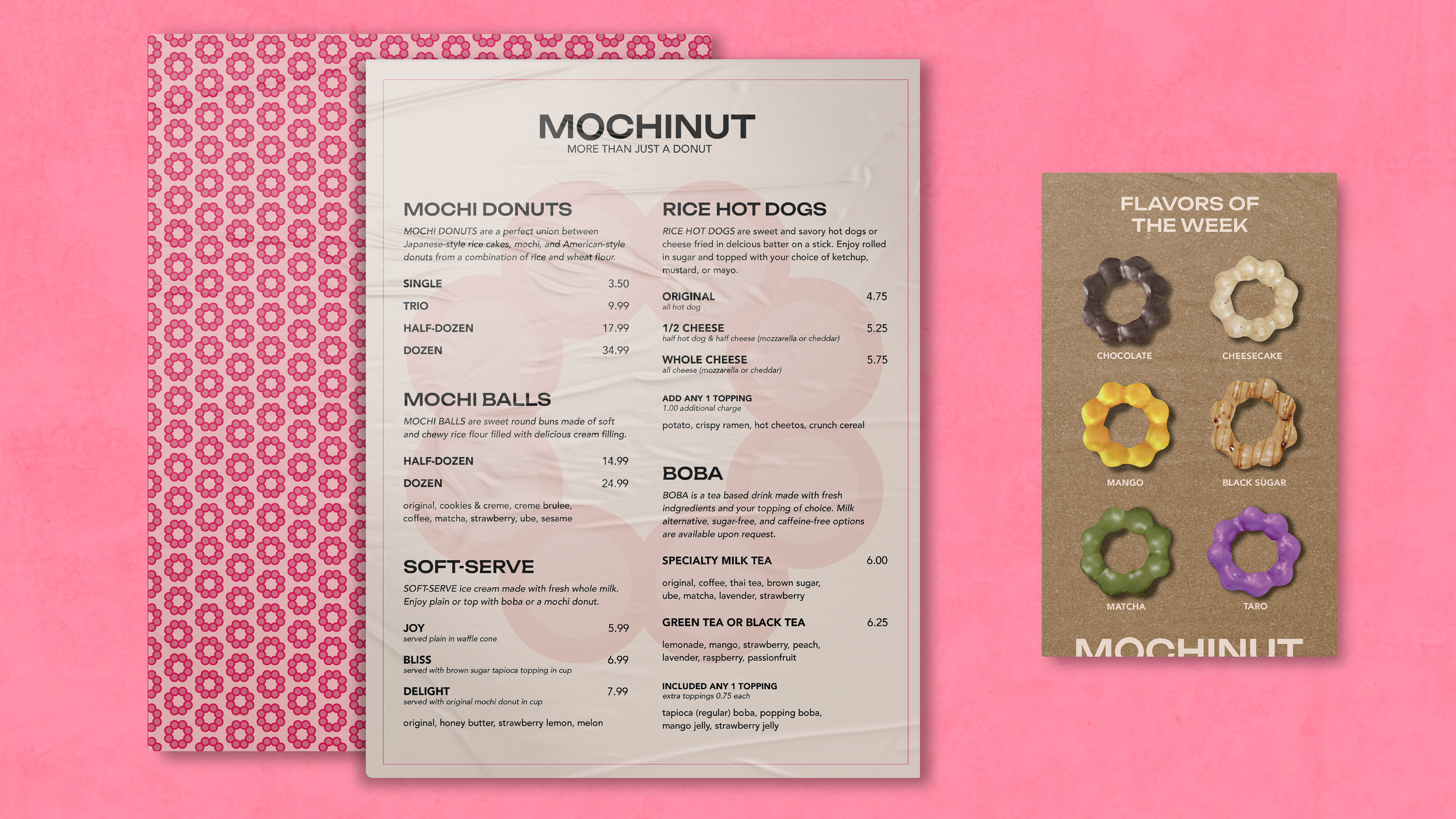
Compared to its existing design, the rebranding of Mochinut uses bright, bold colors that emphasizes the brands fun nature. Mochinut’s new, simplified logo represents their main product in a fresh way and helps communicate the product to new customers.
Additionally, the updated menu design improves user experience by making it easier for customers to navigate their options. The organized layout and clear typography help highlight menu items, ensuring a seamless ordering process. The additional, smaller menu highlights the ‘Flavors of the Week’ in order to help customers and expose new or seasonal flavors.
This redesign makes Mochinut more accessible to both new and returning customers while also adding a fresh take on the brand.

View More Work