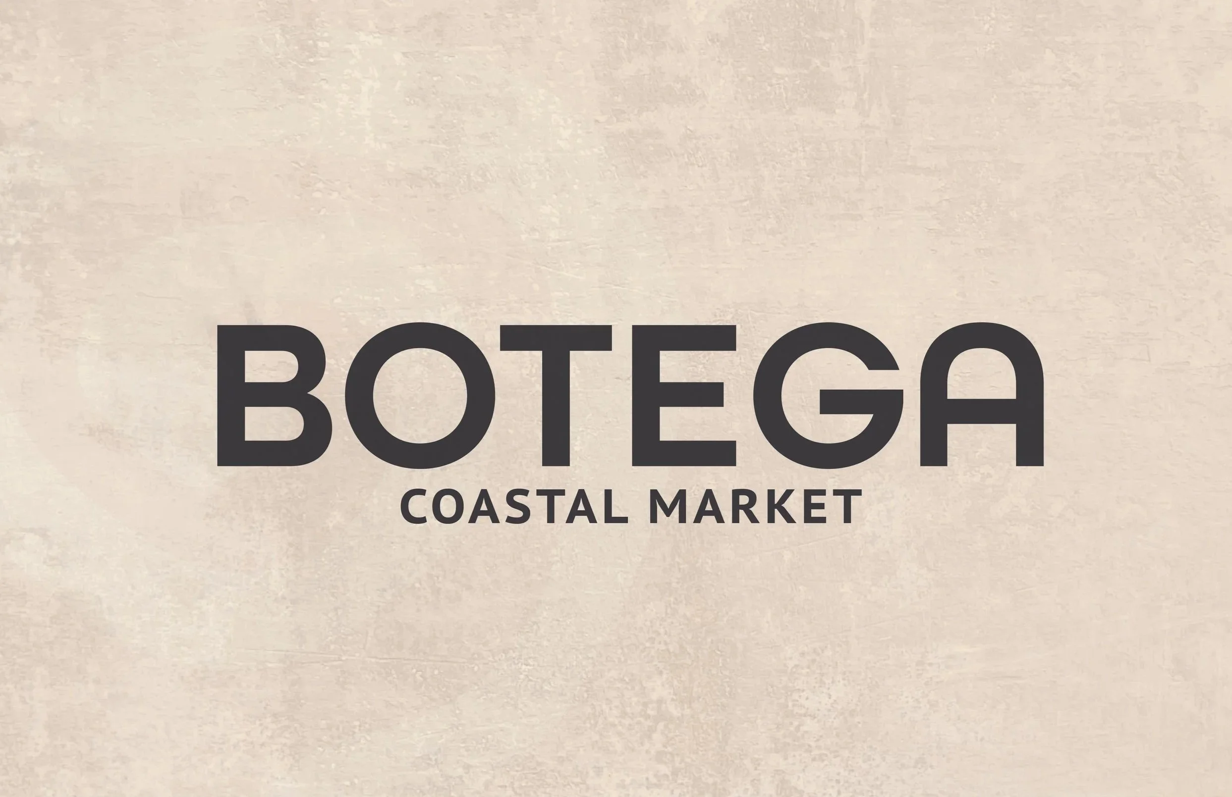
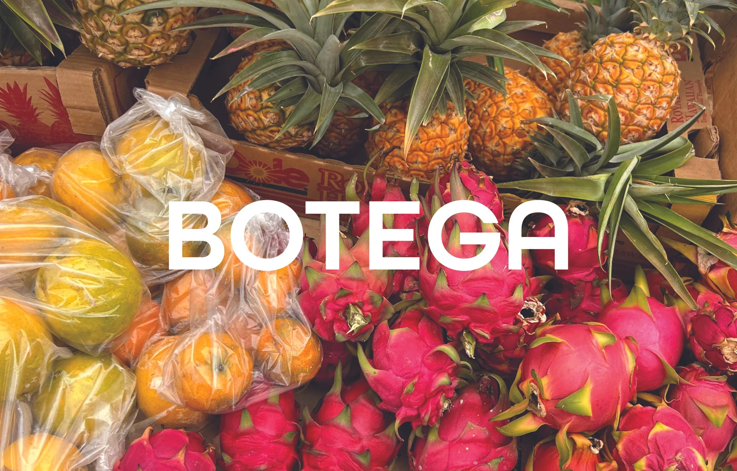
BOTEGA COASTAL MARKET
BRANDING PACKAGING DESIGN
Overview
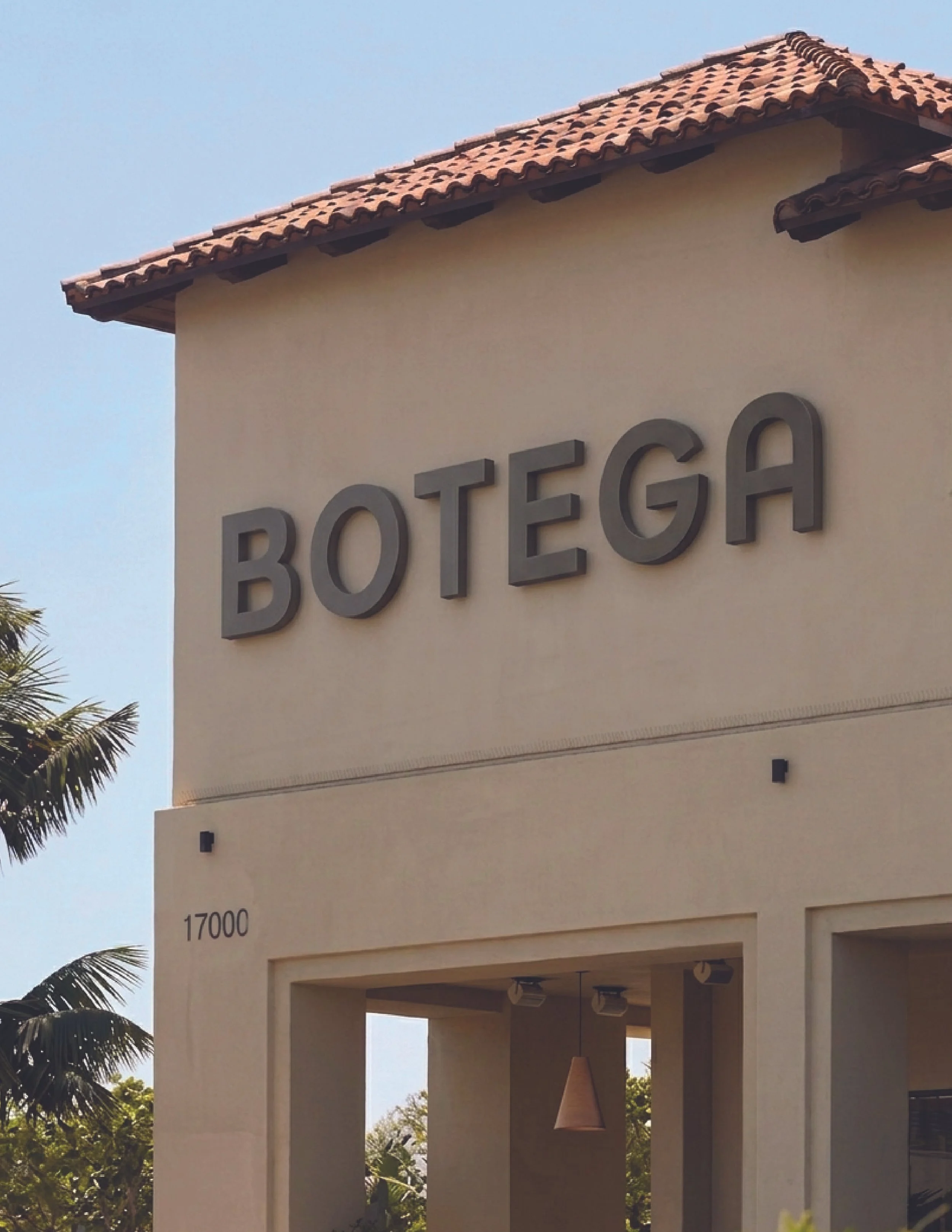
BOTEGA is a local grocery store located in Destin, Florida committed uplifting the local community and keeping the Gulf Coast clean. All products at BOTEGA are packaged with a closed-loop in-store recycling program, with 100% recycled or reusable materials.
At BOTEGA, you’ll discover a store full of unique products, along with everyday basics, in the BOTEGA label. BOTEGA partners with local farmers and artisans for the development of all products. The mission is to embrace a high quality, community-driven, fully sustainable grocery shopping experience.
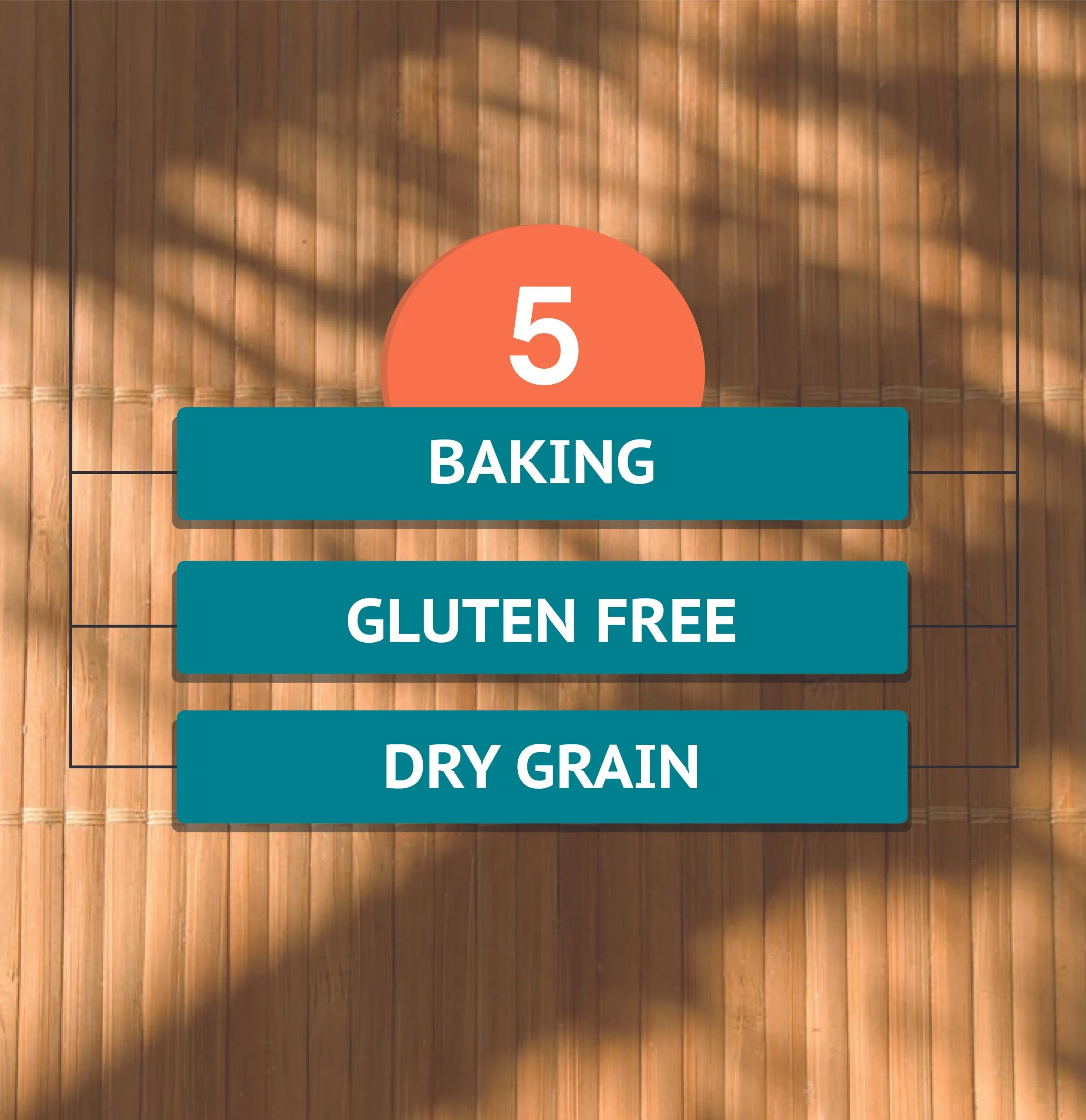
Services
Brand Identity
Packaging
Personality
Coastal
Authentic
Inviting
Typefaces
All Round Gothic Demi
PT Sans Caption Bold
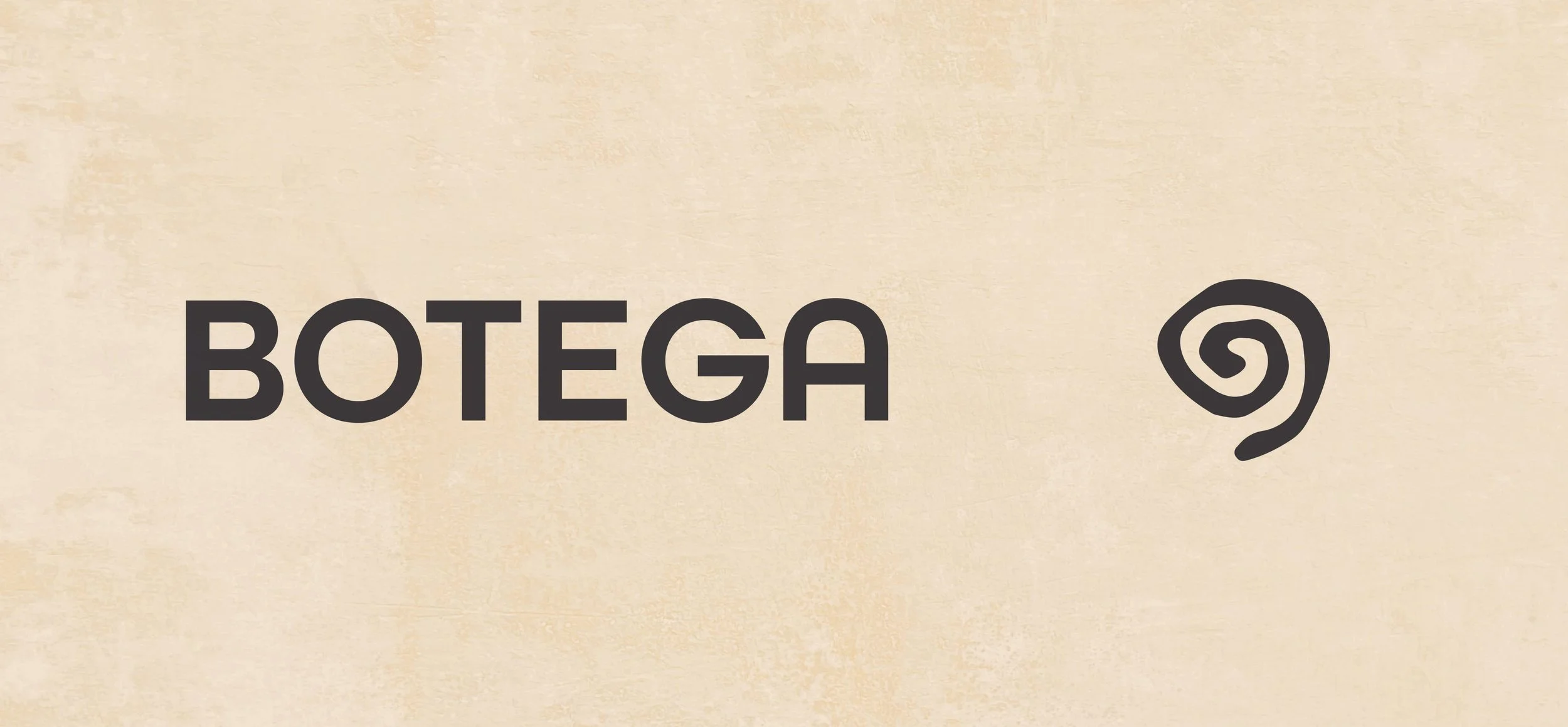
BOTEGA’s logo features a heavy-weight wordmark with rounded terminals, providing clear legibility across various scales. The spiral represents a continuous sustainability loop, referencing the circular packaging and return-and-reuse system. The textured, irregular stroke of the logo is a nod to weathered shells and mimics the effect of sun, sand, and salt water on materials. Paired together, the wordmark and spiral create a balance between reliable exchange and coastal sustainability.
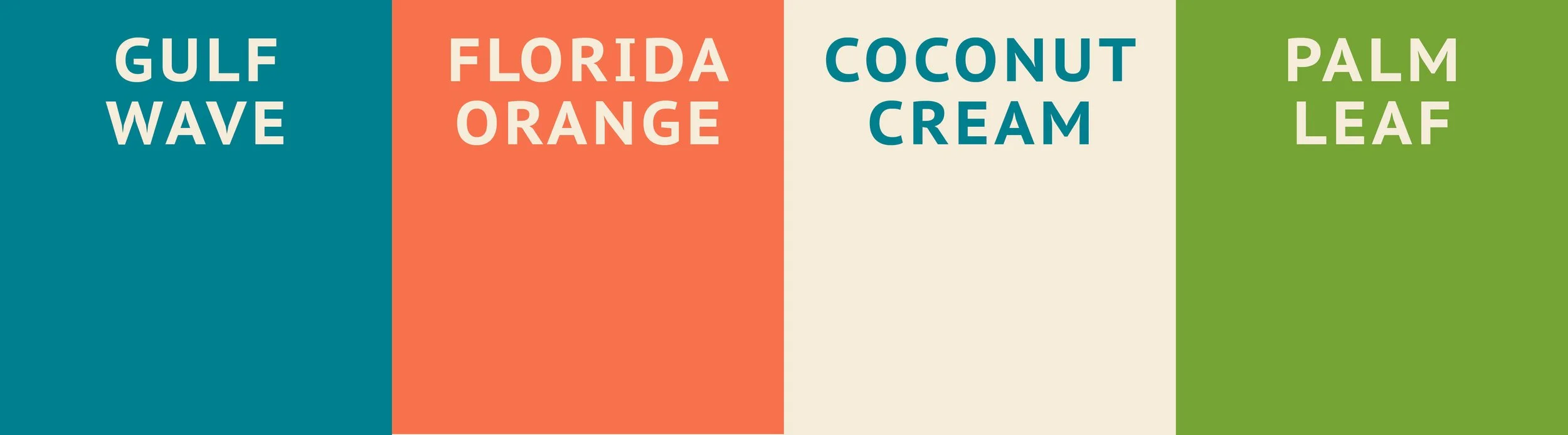
BOTEGA’s main color palette reflect the environment of Florida’s panhandle. Including: Gulf Wave, Florida Orange, Coconut Cream, and Palm Leaf. The saturated colors in both cool and warm tones represents the liveliness of the coast while also allowing the brand to be versatile by conveying both freshness and local agriculture.
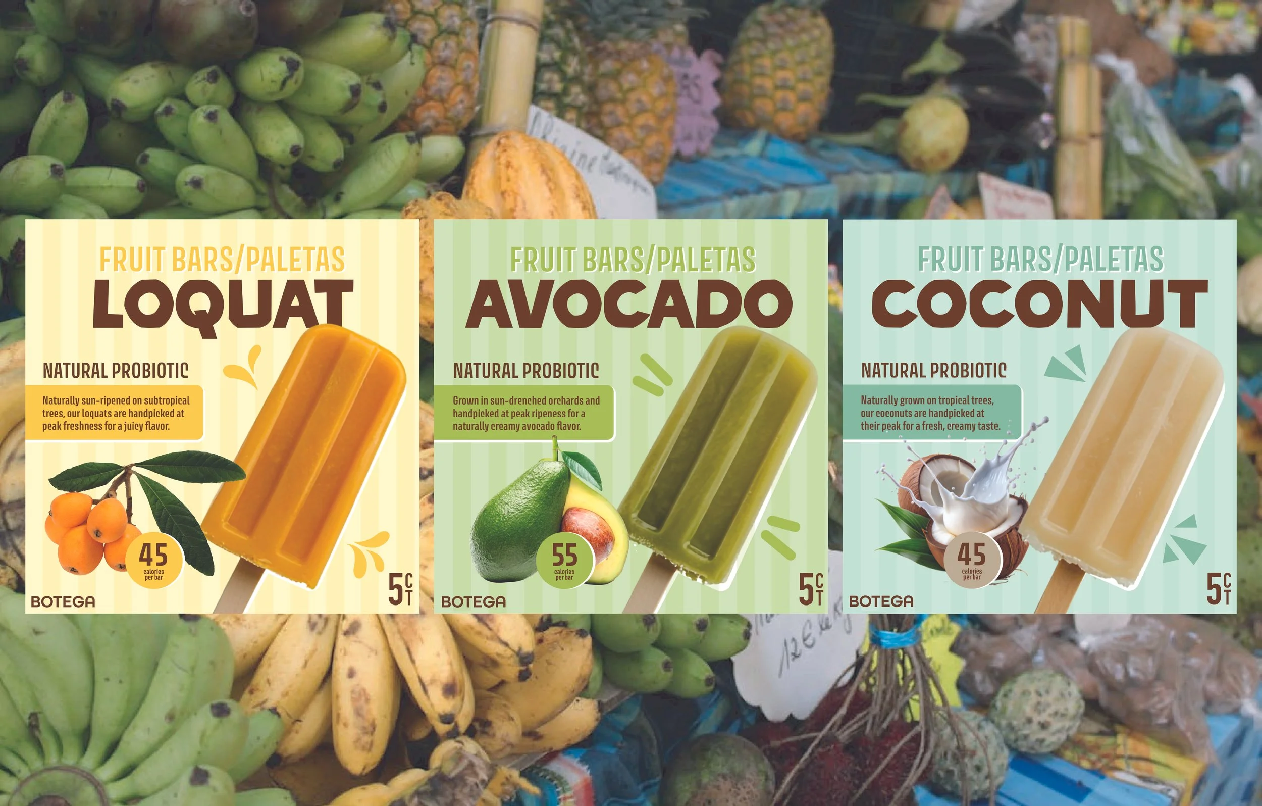
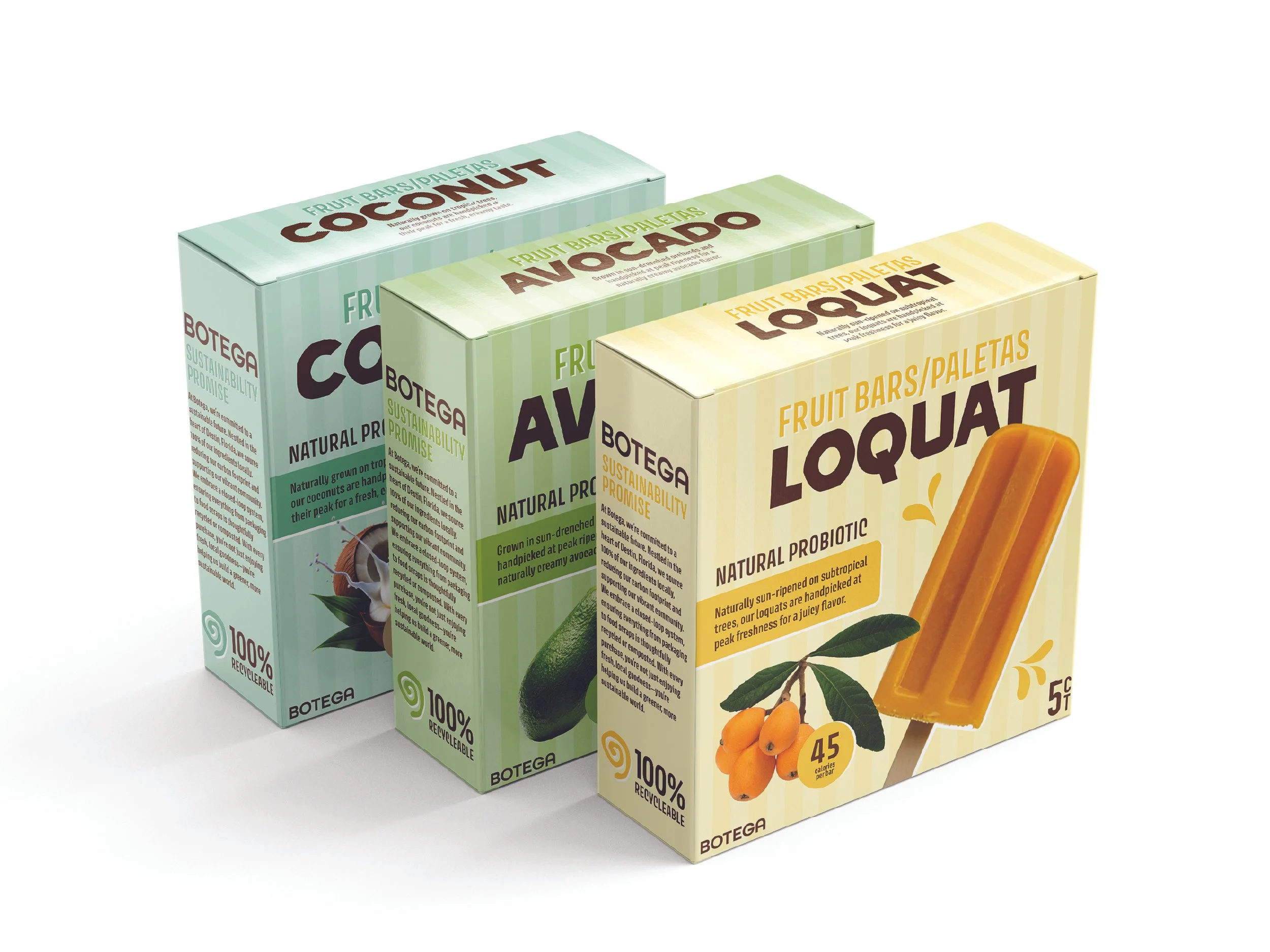
Fruit Bars/Paletas
BOTEGA’s fruit bars/paletas utilize the 11-month long seasonal harvest in Destin, with flavors such as coconut, avocado and loquat. By sourcing ingredients directly from regional growers, the brand emphasizes a transparent "farm-to-freezer" philosophy. Each bar is crafted to highlight the natural profile of the fruit, offering a clean, refreshing alternative to mass-produced frozen treats.
The packaging is created utilizing 100% recyclable cardboard packaging. The material choice reflects a modern commitment to plastic-free design. This approach ensures that the brand’s footprint is aligned with a fully sustainable life-cycle.
Seafood
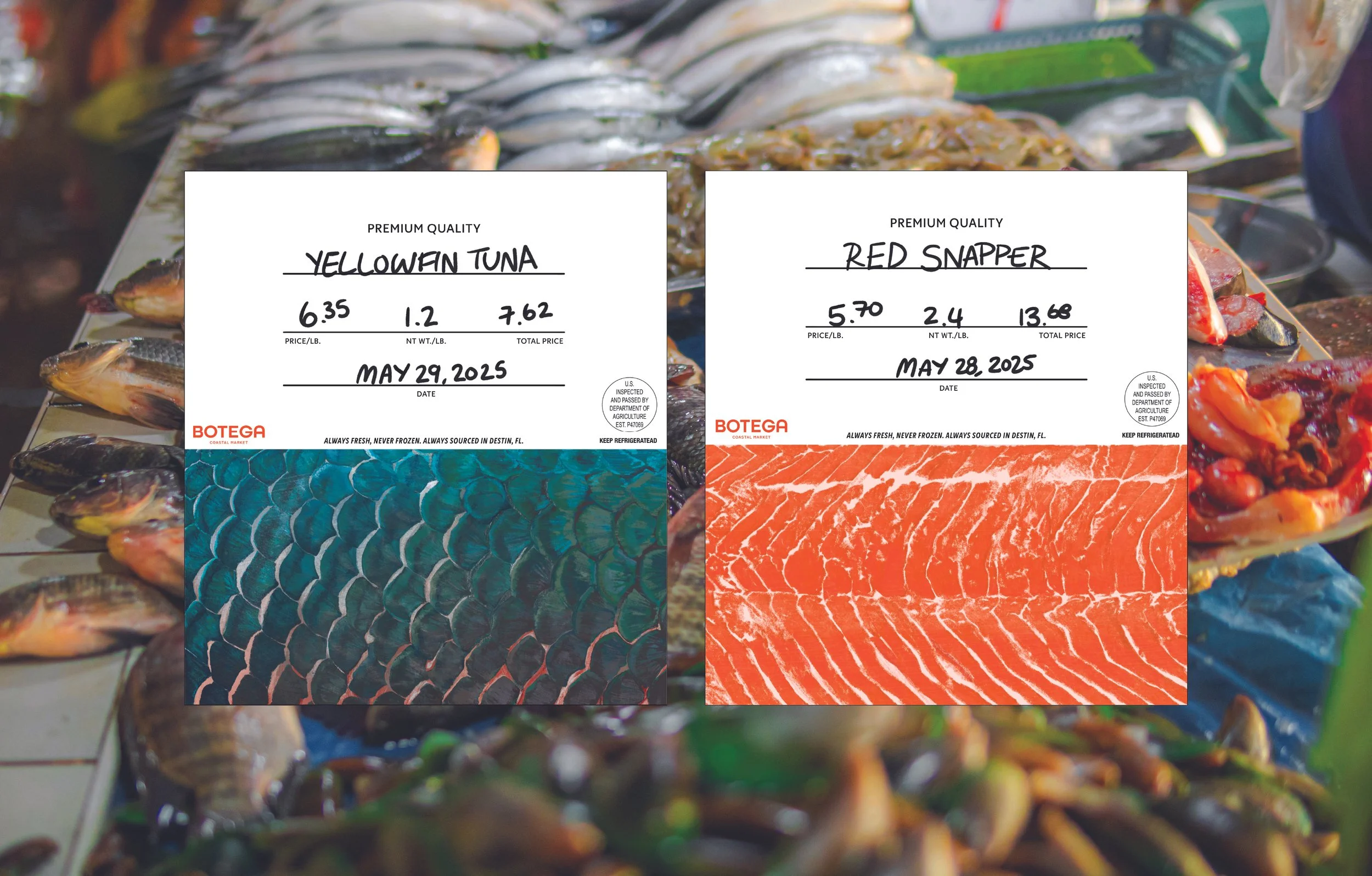
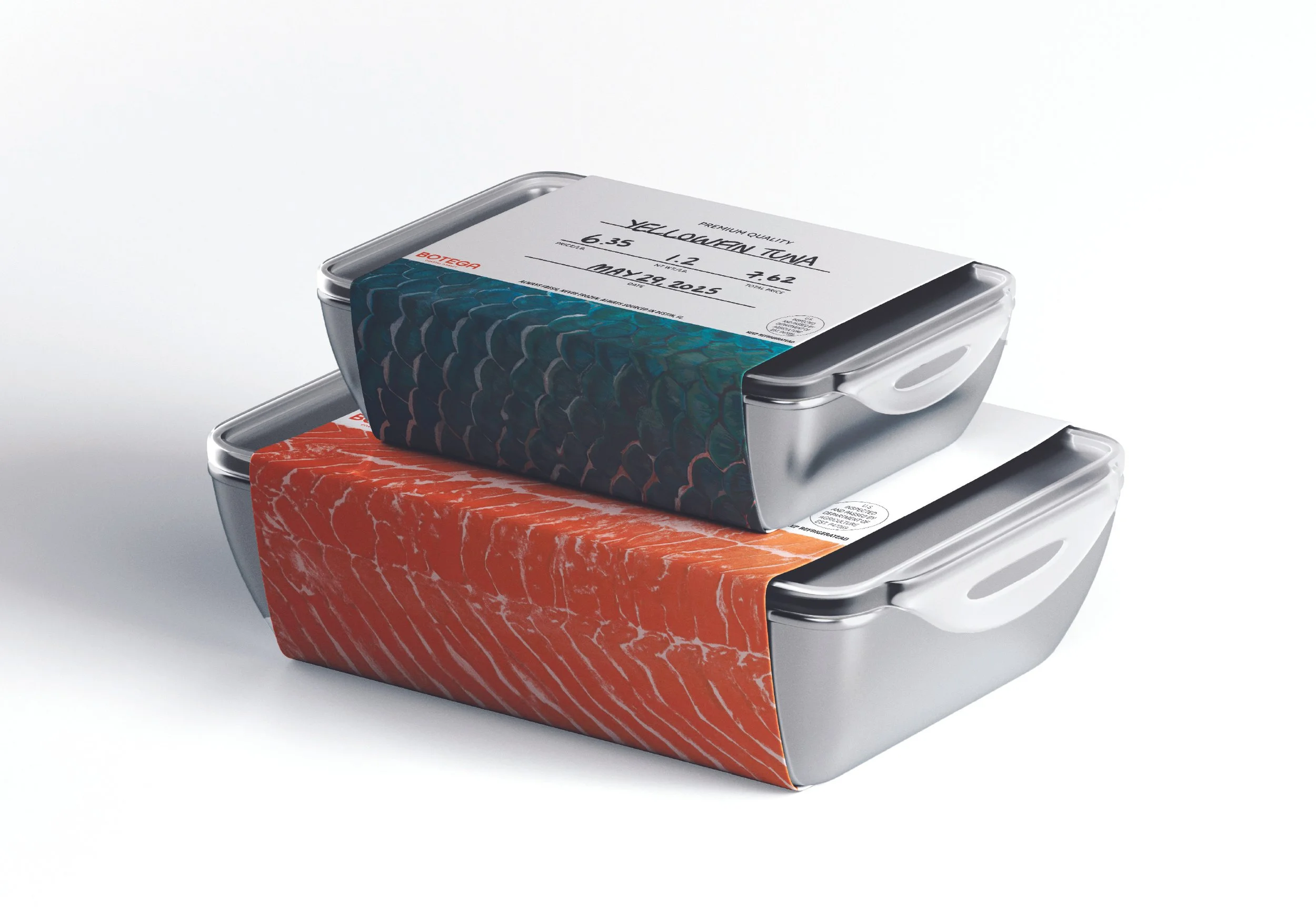
BOTEGA’s seafood packaging system reimagines traditional seafood packaging by replacing single-use plastics and wax-coated papers with a durable, food-safe metal canister. Designed for both functionality and industrial elegance, the lightweight container provides a superior thermal barrier to maintain freshness.
The central design element is a fully recyclable, paper wrap-around label, featuring dedicated fields for handwritten specifications including fish variety, weight, pricing, and catch date. The vibrant, illustrated seafood texture on the sides and bottom is eye-catching in the fridge or freezer and nods to the handcrafted feel.
Customers are encouraged to bring the metal containers back to the store on their next visit to be professionally sanitized and reintroduced into the supply chain. This approach reduces the environmental footprint of the seafood department while creating a recurring touchpoint between the brand and the conscious consumer.
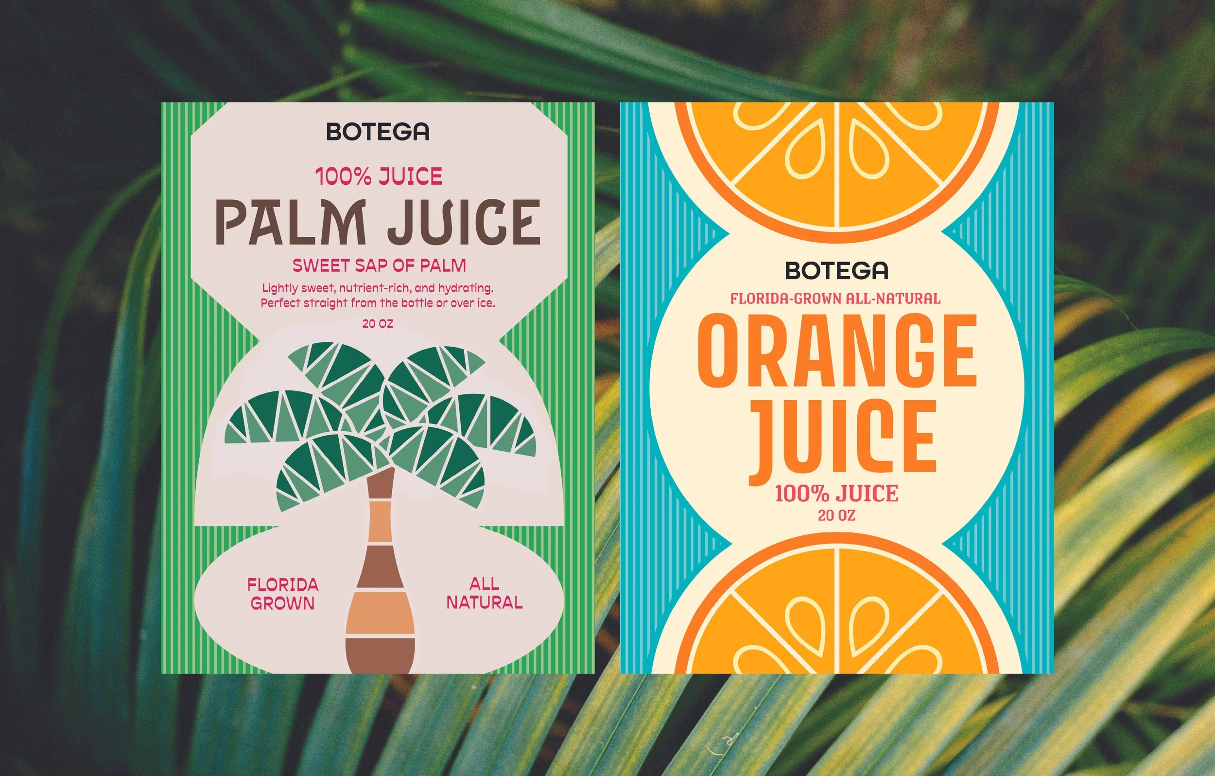
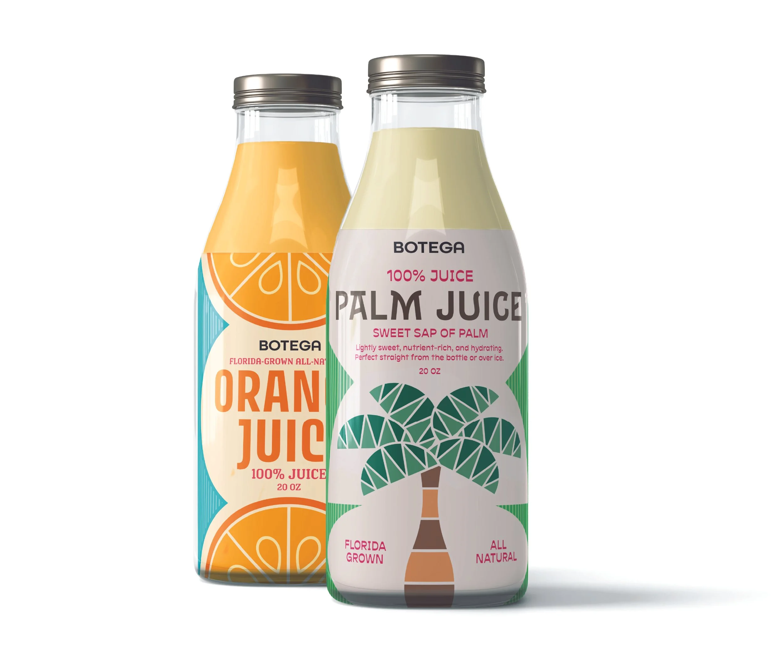
Juice
BOTEGA’s juice bottle concept is created using premium, reusable glass. The packaging mixes clear glass as well as a vibrant label with color palettes that emphasizes the natural colors of the juices. The design of the label has both literal drawings of the source as well as abstract shapes of the source. The combination of vibrant colors and unique typography draws the consumer in by making a mundane product more personable and memorable.
The product encourages a return system that eliminates the need for single-use bottles. Once the product is consumed, the glass bottles are encouraged to be returned to the point of purchase, encouraging a sustainable habit.
View More Work


